Awards
-
Site of the Day
Awwwards
-
Website of The Day
CSS Design Awards
-
Webpicks
Communication Arts
-
Bronze in Real Estate
Rating Runeta
-
UI/UX Design
Behance
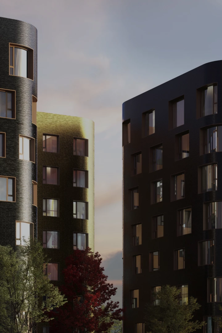
Composition No.24 is a new residential building located in the Moscow’s district that is closely associated with the Russian avant-garde, a modernist movement in the art in architecture which flourished in Russia at the beginning of the 20th century. The area is filled with remarkable artifacts of constructivist and rationalist architecture — groundbreaking conceptual buildings that influenced everyone from the Bauhaus to Norman Foster.
Composition No.24’s facade incorporates the forms from the famous Malevich futurist exhibition, thus paying homage to the Russian avant-garde in general. Our goal with the website design was to create a visual language that would be capable of conveying the project’s unique connection with the historic style, yet at the same time of making it accessible, exciting and commercially appealing to the prospective clients. The avant-garde isn’t everyone’s cup of tea, and when working on a commercial project associated with the type of art, it’s highly important to balance the art’s true colors with satisfying the functional needs of clients who may not relate to it — so that both connoisseurs and regular people find it pleasing.
The project’s visual identity was based on the ideas of the suprematism movement: using just a single basic form, three simple contrasting colors and a highly idiosyncratic typeface. We decided to use these tight creative constraints as a foundation and develop on top of it with a highly dynamic, content-rich presentation. For the content, we researched and filmed the architectural landmarks around the project, created an original piece on the history of the Russian avant-garde, and interviewed the project’s architects. Together with the functional material about the building, it provides a rich content base that captivates prospective residents.
Creating a visually exciting and modern presentation within the strict constraints of the brand’s ID was probably the hardest part of the work. Our solution was to create a different layout for every part of the presentation using simple geometric forms and then bring a spark to it by animating the interactions and transitions between the views. As a result, the final product looks minimalistic and conceptual in static, yet creates unexpectedly rich and entertaining impressions when you interact with it.
The UI for the apartment selection is an original and highly advanced concept that makes the website look and feel cutting-edge technologically. The website’s intro is also an original piece, an allusion to the suprematist drawing that morphs into the building using browser-based vector animation.


